
All shadows had pretty decent staying power even without a primer and didn't migrate to places they didn't belong.
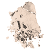
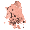
Honeymoon (Color Focus): This one appeared in both compacts and is a very versatile highlighter. It's a cool toned, very soft shimmer ivory. I wasn't expecting much from a color so light, but while indeed not very pigmented, it has enough presence to actually do some highlighting of my darker-than-average skin. The shimmer is light and subtle, suitable for day, and the color works well as a base. It's much better than Bobbi Brown's invisible Bone.
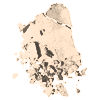 Gaze (Color Design, Shimmer): Warmer than Honeymoon, it's a light champagne color. I think it's more pearl than shimmer. Very pretty and blends well with browns and bronze. The shimmer effect is still not over the top and can definitely be used during the day.
Suntouched (Color Focus): A light, bronze-touched gold. A warm tone that's probably more suitable for the warmer, tanner months. It has the same kind of light shimmer as Honeymoon, but with this darker color, its presence is more pronounced and I'd advice a lighter hand in applying it. I'd probably avoid it altogether unless I was going for a very bronzed, mid-summer look. But someone with a warmer skin tone might find it more wearable.
Mocacchino (Color Focus): The color swatch from Lancome's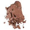 website is a bit misleading here. Mocacchino is actually a cool shade, very neutral, and probably more taupe than brown. It's comparable in color to the taupish one from Bobbi Brown's Chocolate Palette, though I much prefer Bobbi's creamier texture and darker pigment.

Dill (Color Focus): This one is probably my favorite. It's a cool, slightly heathered khaki, with just enough green to bring my eyes to life, but it's muted enough to be perfectly suitable for casual day wearing. It also works great as an eyeliner: I used it with Paula Dorf's Transformer and liked the result (though the green was less pronounced this way).
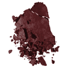 Lezard (Color Focus): A deep, dark brown color. Very pigmented, works great for darker skin tones. It's good for lining, contouring and adding some drama to the crease. It has some very tiny glitter flecks, that aren't over-the-top, but I'd still advise a light hand, especially if you have a lighter skin tone. This shadow reminds me a little of the darkest one on my Snake Charmer Lorac palette. But Lezard is a tamer one reptile.
Couture (Color Design, Intense); This is a dark, matte chocolate brown, very pigmented and intense. It's very much like the darkest shadow from Bobbi's palette, and since most Color Design shadows have a better texture than Color Focus, it's trully comparable . It's great for a smoky eye look, perfect for lining, and applied sparingly, also very wearable for day.
 Gaze (Color Design, Shimmer): Warmer than Honeymoon, it's a light champagne color. I think it's more pearl than shimmer. Very pretty and blends well with browns and bronze. The shimmer effect is still not over the top and can definitely be used during the day.
Suntouched (Color Focus): A light, bronze-touched gold. A warm tone that's probably more suitable for the warmer, tanner months. It has
 the same kind of light shimmer as Honeymoon, but with this darker color, its presence is more pronounced and I'd advice a lighter hand in applying it. I'd probably avoid it altogether unless I was going for a very bronzed, mid-summer look. But someone with a warmer skin tone might find it more wearable.
Mocacchino (Color Focus): The color swatch from Lancome's
 website is a bit misleading here. Mocacchino is actually a cool shade, very neutral, and probably more taupe than brown. It's comparable in color to the taupish one from Bobbi Brown's Chocolate Palette, though I much prefer Bobbi's creamier texture and darker pigment.
Dill (Color Focus): This one is probably my favorite. It's a cool, slightly heathered khaki, with just enough green to bring my eyes to life, but it's muted enough to be perfectly suitable for casual day wearing. It also works great as an eyeliner: I used it with Paula Dorf's Transformer and liked the result (though the green was less pronounced this way).
 Lezard (Color Focus): A deep, dark brown color. Very pigmented, works great for darker skin tones. It's good for lining, contouring and adding some drama to the crease. It has some very tiny glitter flecks, that aren't over-the-top, but I'd still advise a light hand, especially if you have a lighter skin tone. This shadow reminds me a little of the darkest one on my Snake Charmer Lorac palette. But Lezard is a tamer one reptile.
Couture (Color Design, Intense); This is a dark, matte chocolate brown, very pigmented and intense. It's very much like the darkest shadow from Bobbi's palette, and since most Color
 Design shadows have a better texture than Color Focus, it's trully comparable . It's great for a smoky eye look, perfect for lining, and applied sparingly, also very wearable for day.


I love that Dill shadow! Gorgeous!
ReplyDelete